What is Mid-Century Modern (MCM)? Why is it making a comeback in style? And, why in South Alabama? by Jerry Johnson

“Sienna Cloud” has been assisting in the creation of a MCM booth within Troy’s “Burlap & Silk Store” in downtown Troy. It has been branded as the “V - ROOM” because it exhibits vintage, vinyl, and vibes from this era. It has been a blast (from the past) for me! Subsequently, I’ve been bombarded with lots of questions from the community about the very meaning and nature of “mid-century modern”.

Although “Sienna Cloud” is my personal art studio, it is not limited to simply painting and design. In fact, there has been a flurry of creative activity lately in acquiring and preparing to showcase this interesting period of art, design, and architecture to the locals in Pike County as well as those passing through.

So, let me try my best to address the common questions posed in this blog title.

1) What is Mid-Century Modern (MCM)?

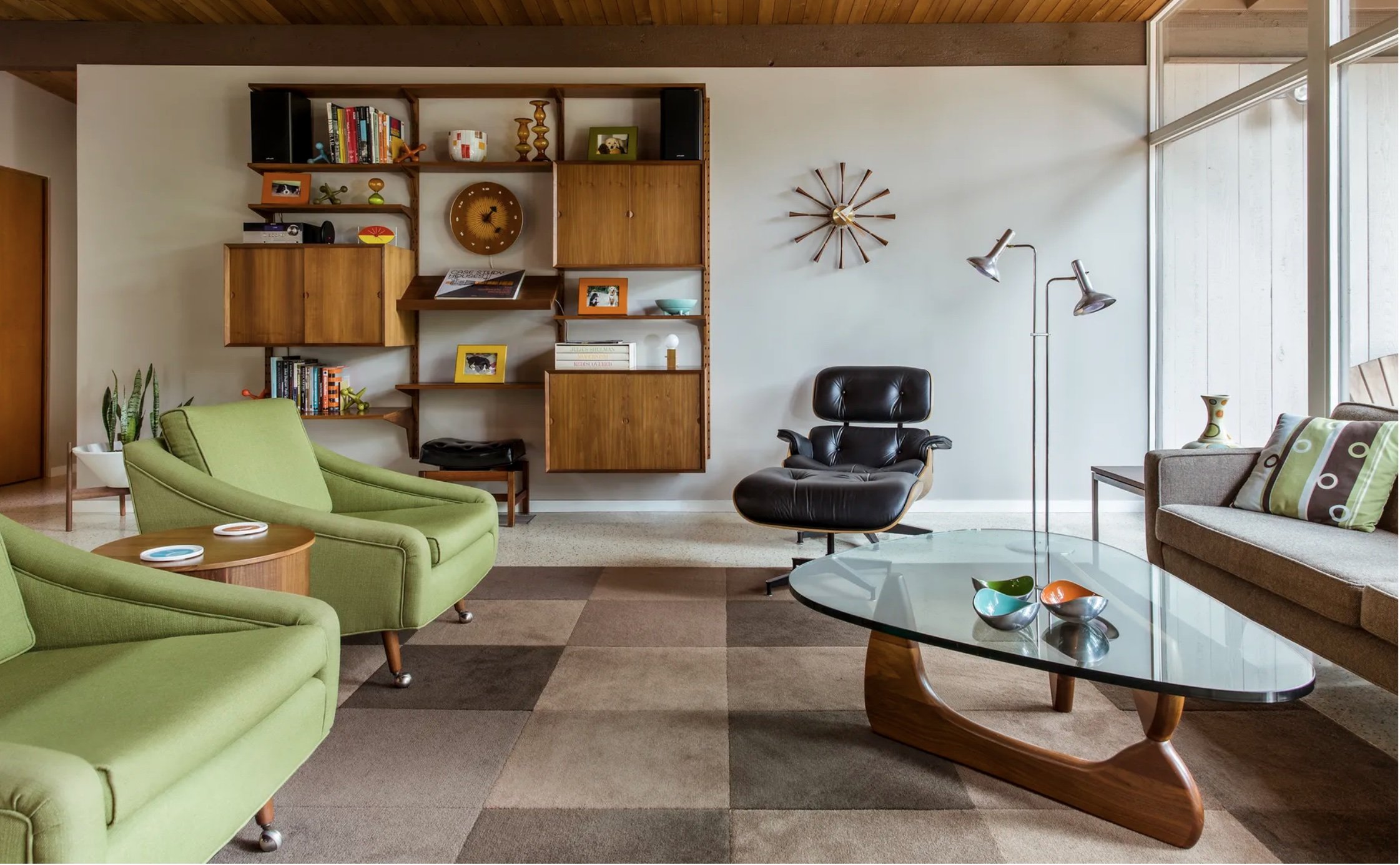
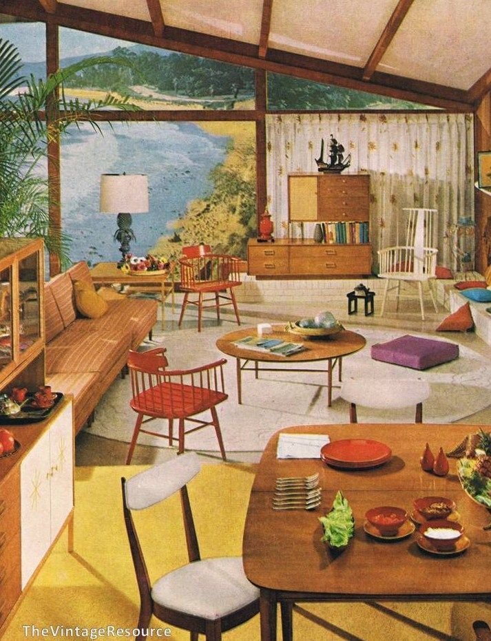
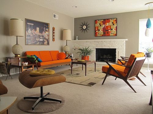
The “period” referred to as mid-century modern (MCM) follows WWII, from about the mid-1940s to the late 1960s. During this time, America had a booming economy as well as “booming babies” (baby boomers?). Many young families were growing rapidly and their new homes were enjoying a new—more modern look. This was reflected firstly in architecture and then interior design, home decor, and art/fashion in general. New materials were also being explored like plastics and laminated woods. Here is a small gallery of examples:

2) Why is MCM Making a Comeback in Style?

Ironically, I grew up in this era, but my family did not fully embrace the “modernity” of the times. My parents (actually, most folks that I knew in rural Oklahoma) pretty much decorated in a more traditional Americana style full of highly decorative motifs and scalloped edges instead of clean lines. Heavy window coverings and ornate decor was the norm for my visual upbringing. MCM as a style was far more common in other urban areas and some suburban regions. There is definitely a timelessness to the MCM aesthetic. Somehow, it always feels contemporary and fresh.

Eight seasons of MCM revival…


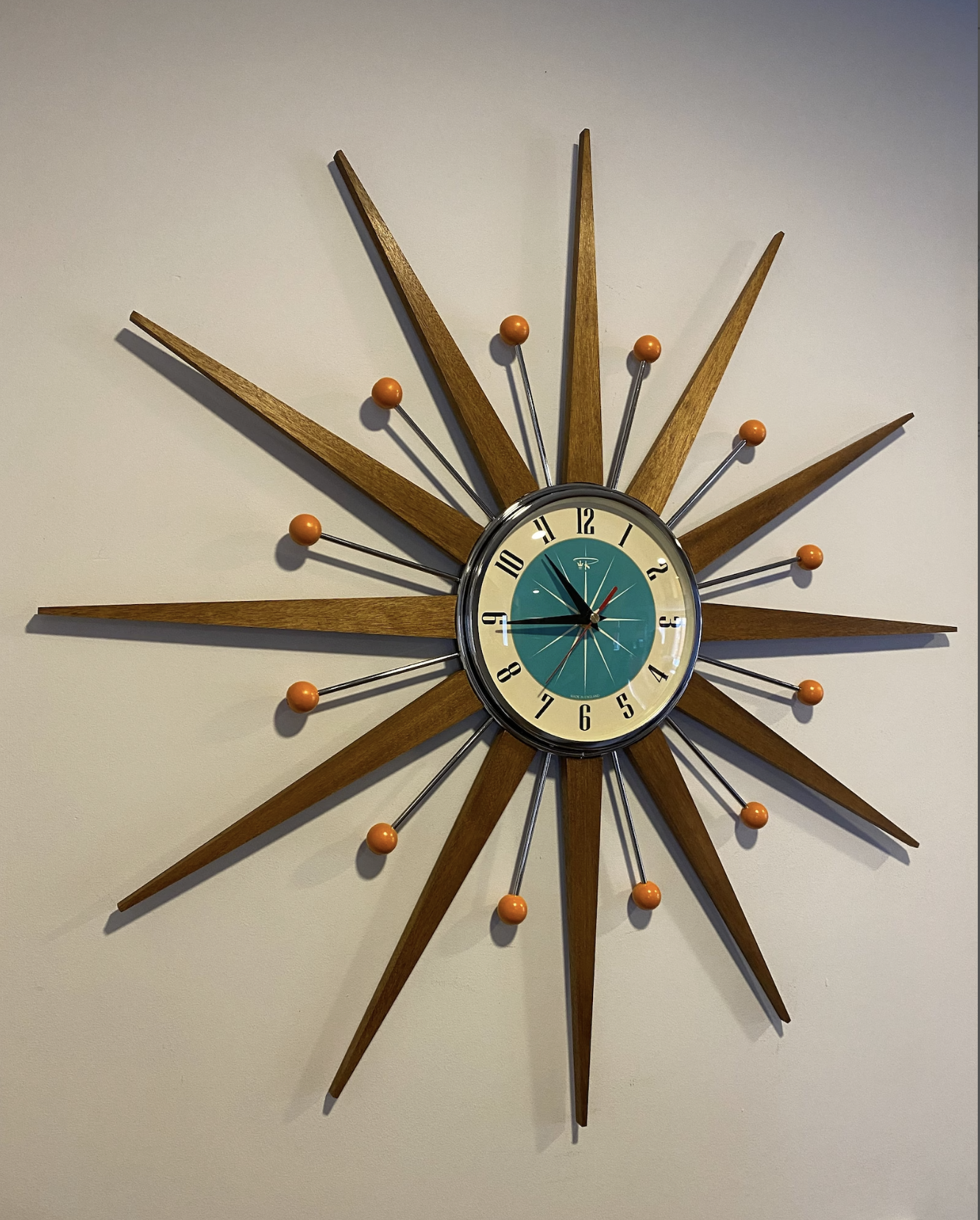
Many millennials associate the style with the popular TV drama, Mad Men. Without a doubt, during the years that Mad Men was airing the style exploded in popularity. Simple and clean lines, well-made, curved contours on both furniture and decor, great lighting from windows and lamps, intentional consideration of spatial rest areas, fun but tasteful use of bright colors, these are just some of the qualities that give MCM a classic and timeless presence with any generation. At times, MCM can even seem futuristic (ie. the Atomic Age). We have to consider the rise of the “space age” and cartoons like The Jetsons.

Left: Furnishings inspired by the Space Age; Right: The futuristic and lovable Jetson Family.

3) And, Why in south Alabama?

The past decade or so we’ve seen a huge surge in Shabby Chic or Country Chic as a decorative style. If we back away and take a wider gaze at these two “styles” we can sense some commonalities with MCM—a certain intentional use of positive and negative spaces, an infatuation with contrasting textures, and interestingly— pieces in both styles are currently popular priorities for thrifters (potential money savings) in bringing charm and joy to their living spaces. So, why not, Alabama? Let our love for creativity and passion for nostalgia abound! Hey, let’s make cool spaces in HOT places like the deep South! Perhaps we could even consider doing a Shabby Chic / MCM mashup? Enjoy and express.

We will certainly better enjoy the spaces we inhabit with that sort of mindset.
— Jerry Johnson

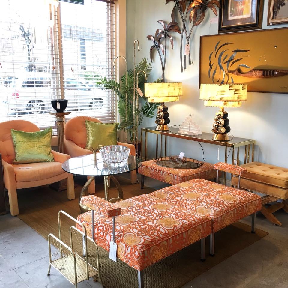
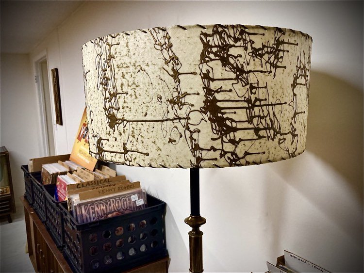
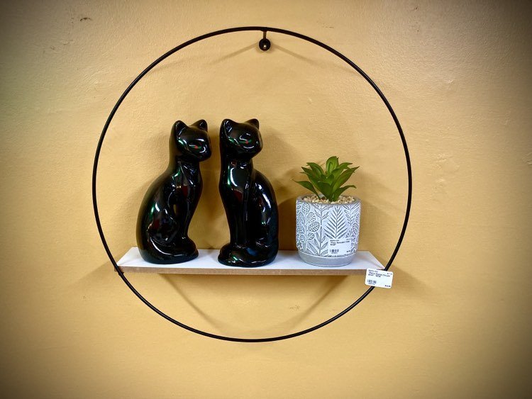
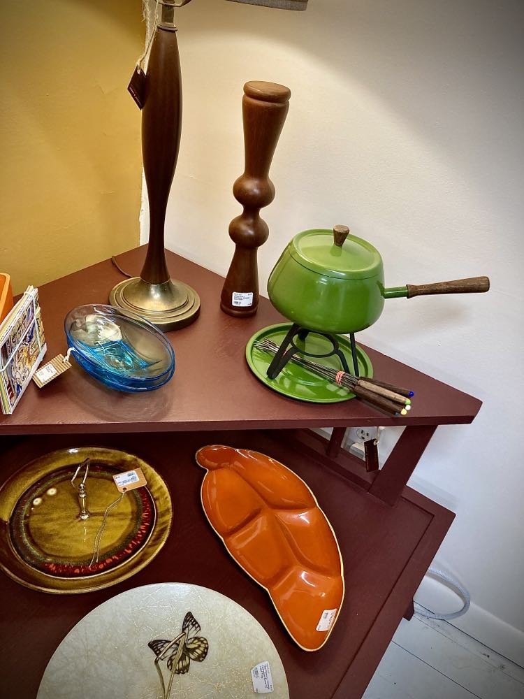
Take a step “Back to Your Future” by visiting the “V–ROOM” upstairs in Troy’s very own “Burlap & Silk” downtown on the square. Enjoy a broad array of reasonably priced vintage MCM items as well as more current items that carry the same retro vibe! From furniture to lighting to kitchen to artwork. There is also a wide assortment of 50s, 60s, 70s, and 80s vinyl records (ever changing) as well as some vintage postcards (that gift for friends and family far and wide).

“Burlap & Silk” is open Tuesdays through Saturdays from 10AM until 5PM. The inventory of the entire store is extremely eclectic so there is something for everyone. “Sienna Cloud” is a creative studio in downtown Troy that hosts a booth on the first floor near the entrance and also assists with the “V–ROOM” upstairs. We would love to have you visit us!


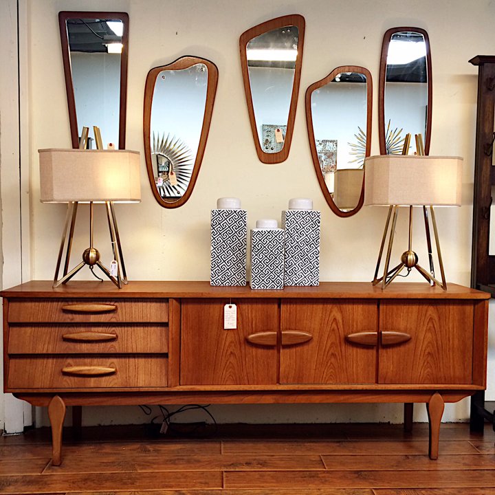
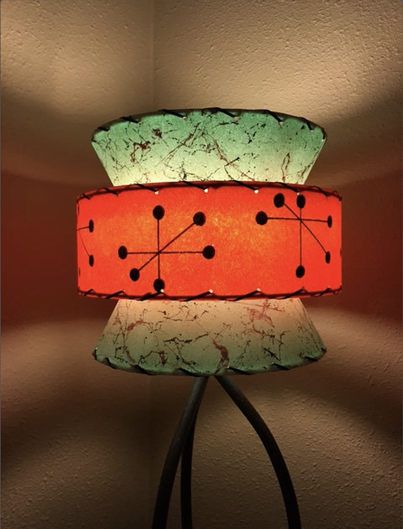
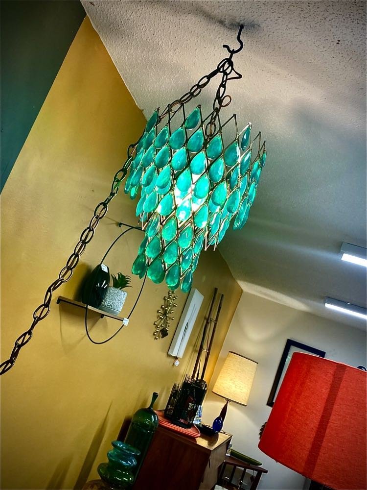
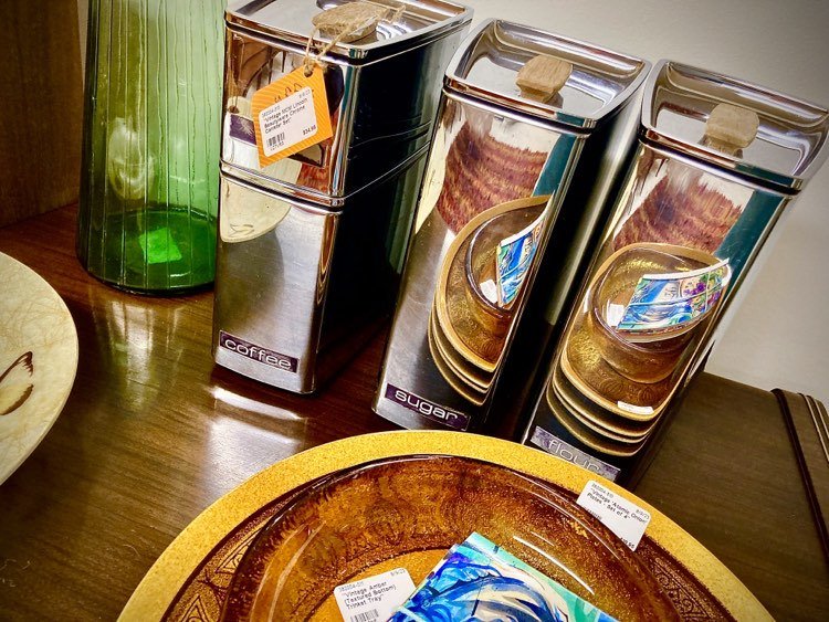
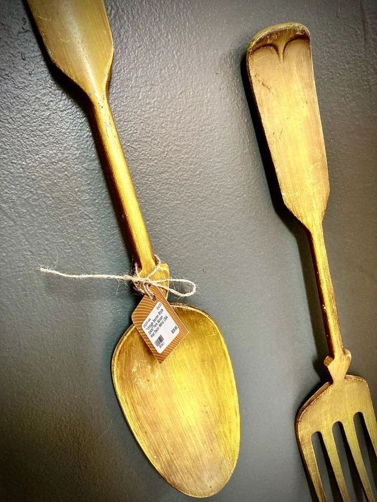
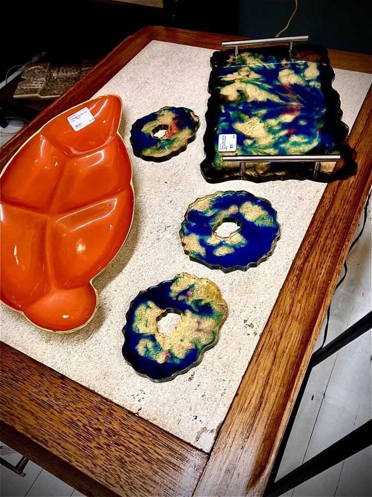
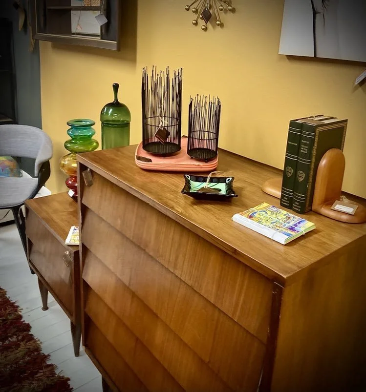
Below are some visual snippets of the product in the “V - ROOM”:

If you have questions about anything related to art, design, antiques or more, don’t hesitate to contact me—Jerry Johnson—at Sienna Cloud Studios (334) 268-1304 [send text please] or email at jjkees@gmail.com.

Ode to Oddie (pronounced "Oh' - dee") by Jerry Johnson

This journey in my canine portraits continues. These special creatures and friends bring so much virtue and value to our human existence that it’s difficult to ignore their impact on our lives.

I introduce you to Oddie who is a Jack Russell Terrier. He lived with some dear friends of mine in Troy, Alabama. These friends actually inherited Oddie from their daughter. Jack Russell’s are typically high strung and even nervous at times. And, oh how this one LOVED chasing squirrels!.

If you even said the word ‘squirrel’ he would get excited and look intently to see if one was around.
— Oddie's Guardians

Oddie actually did catch several squirrels over the years. The first one he actually brought to his “Guardian Mum” while she was still in bed. He was a very smart dog. His whole life revolved around “Mum”. Wherever she was, he would be there too. He slept with her, ate with her, and if she went somewhere, he was in her lap.

In the last couple years, Oddie lost his hearing and his sight. He was still able to navigate his way around the house. Ultimately, the decision had to be made to put him to sleep on “Good Friday” of last year. It was one of the hardest thing that Oddie’s humans had to do.


Below shows the progression of this transparent watercolor from beginning to end.

Oddie is depicted here in his favorite chair.

Below is the culmination of a shared experience with my client. There were several nuances and characteristics that were not necessarily revealed in a still photo so the conversation between client and artist was extremely valuable and fulfilling!

Oddie depicted in his favorite chair.

If you have a pet that you would like to have painted in a similar fashion, don’t hesitate to contact me—Jerry Johnson—at Sienna Cloud Studios (334) 268-1304 [send text please] or email at jjkees@gmail.com.

Every dog has her day! So, I suppose it is Sam’s turn. by Jerry Johnson

I’ve not done many portrait paintings in my life. And to be completely honest, I’ve NEVER done a canine portrait. The opportunity arose when I was asked if I “would” and more importantly, if I “could”?

I totally understand that some might think that an animal portrait would be much simpler than a human one. Trust me, and most of you reading this probably already know this, pets’ faces and bodies (even the exact same breed) are as different as people are.

Close up view of Sam’s profile.

Introducing my subject—Samantha, an English Mastiff— who resides in Valdosta, Georgia with her owners/guardians. They first discovered Sam in 2011 at a “puppy store” in Las Vegas. It must have been love at first sight because they were previously considering a Golden Retriever.

Sam was easy to fall in love with as she had the sweetest face.
— Maria

And, she has always retained a sweet temperament and is great with the entire family. Sam would always watch over the children when they went outside to play. She is a very docile dog which nobody would ever think that she could become aggressive, but if she does feel that her family members are in danger, she will immediately make it known that she’s there to protect them.

Sam goes to work with Maria (her owner) every day. Clients are always asking about her for Christmas. They bring her gifts as she’s so beloved, and Sam’s fellow workers actually celebrate her birthday at work as well with the boss, complete with the unwrapping of gifts. 


It’s always interesting to see the evolution of a painting or work of art. Below shows the progression of this transparent watercolor from beginning to end.

Ultimately, Sam’s portrait is complete and delivered to the client who will mat and frame according to their aesthetics. Below is a simple mockup of the finished portrait as if it was already framed.

Framed mockup of final, full-body portrait of Sam.

It was a great JOY to pay homage to this true, longtime, household companion to my clients. Sam stands nobly and aware of the great care she has received.

If you have a pet that you would like to have painted in a similar fashion, don’t hesitate to contact me—Jerry Johnson—at Sienna Cloud Studios (334) 268-1304 [send text please] or email at jjkees@gmail.com.

Anatomy of a Watercolor Commission by Jerry Johnson

Hey, Jerry! Do you know…

anybody that I can commission to paint a picture of my family cabin?

I have to be honest, it has been YEARS since I took on a commissioned painting. When I was approached by someone asking me this question, something welled up within and I declared to myself, ‘C’mon! You can do this! You’ve been doing commercial art for years!’

Besides, it was a dear friend of mine and he deserved the best, right? Lol. Seriously, after two or three decades of primarily doing computerized, design work for numerous clients, I was ready to actually paint again—like I did years earlier in my artistic journey.

My friend described what he was looking for—a transparent watercolor painting of a “cabin in the woods” that he and his wife have spent years preparing and enjoying. This cabin is on family property near Banks, Alabama going back for years so it has significant meaning to them as well as to their children and grandchildren.

As you can see from the notes I made below, my friend had a strong level of specificity in what he desired. I was fortunate to get a personal tour of the cabin property as well as a viewing of the transparent watercolors (mostly rural landscapes) in his private collection before I began sketching. I thought I had a good idea as to his expectations.

Extemporaneous notes from our initial conversation.

Reasons for doing this commission?

As I’ve stated before, I’ve primarily been a “designer” or “commercial artist” for many years. I have no problem trying to please a client, in fact, that’s been my primary goal. Of course, in this instance there was even greater possibility of personal satisfaction because I truly desired to:

  1. get back into transparent watercolor as an art medium;

  2. paint some local, rural landscapes; and

  3. do something nice and meaningful for a family whom I loved.

Gathering the necessary resources to begin.

During my visit to the “cabin in the woods”, I took numerous photos and made a few light sketches/notes. The client (my friend) also provided some photos of his own which were extremely insightful because it better revealed to me how he viewed the space.

This was not going to be an easy composition because it involved so many elements that were important to the client. Here are a few:

  • the cabin (of course) • outdoor gathering areas with picnic tables, stone/wood benches, stone fire pit, swings, tables, chairs, and more • lots of foliage (trees and plants) • iron bell on wooden post • outbuilding with lean to • Kubota tractor and four-wheeler • some outdoor pottery • some positioned, large rocks

Here is a sampling of the many photos that we took on the property.

So the work began!

We determined that the finished, image-size would be 18” wide by approximately 10” tall. That’s not a huge footprint for so many elements in a composition. I knew I would have to edit carefully and force the atmospheric perspective a bit (making things look farther away by simplifying details, cooling the colors, and diffusing the clarity).

I first worked out the overall composition and sought approval from the client. That initial drawing is shown below. The client approved of the layout so I began masking some areas with a liquid mask called “Frisket Masking Fluid”. For those that don’t know, a “transparent” watercolor means that the whites that are seen in the painting are simply white paper showing through. The general rule is that you paint light-to-dark (unlike oil or acrylic painting). To aid in this process, the painter can use several methods, but the one I chose was brushing on a liquid mask which dries rubbery and can be peeled off later in the process—preserving the paper or color beneath.

Original light, sketch on Arches 300 lb. Watercolor Paper

As with any art-making or craft, the process is critical—both in technique and in preparation. The final point-of-view for the painting did not allow for the wanted, iron bell to be in the field of view. So, after discussing with the client, it was determined to have the bell cast a shadow from its actual location onto the foreground of the scene (bottom right).

One more issue did arise during the process. Due to the thick foliage in the original photos, I did not notice the “chimney” peeking from the back side of the cabin roof. Since we wanted to thin out the low-hanging limbs and foliage to allow for the roofline to be seen, I needed to lift the background pigment a bit by moistening and scrubbing (thank goodness for durable, 100% cotton paper) to add the chimney (a lighter colored element) over the greenish background behind roof line.

I hope that an explanation of this process was enlightening a bit and even helpful in understanding transparent painting and working out the problems of a commissioned work. Blessings always and feel free to contact me should you wish to discuss a commissioned watercolor or other creative work.

Finished Commission…

Depiction of how the watercolor would appear framed and matted.

If you would like to see more works like this (or even not like this), feel free to visit my studio by appointment at 113 North Three Notch, Troy, AL. Enjoy!

Family Reunion By Design by Jerry Johnson

As many of my readers/friends already know, I’ve done lots of designing for family throughout the years. I particularly love designing for the Bentley Family reunions. At a minimum, reunions require promotion, advertising, save-the-date reminders, emails, correspondence, and much more. Since all this needs to be done, why not go ahead and brand it and make it a real campaign full of LOTS of cohesively designed pieces.

This was the general typographical concept for the themed Reunion.

Due to COVID 19 our traditional triennial family event was postponed by an additional two years so it had been five (5) years since our previous gathering. It was so great to finally be together again!

There were over 100 family attendees this year. This is just our “clan”—generational offspring from Pete and Twila Bentley of Laverne, Oklahoma. This was the “serious” pic. You should see the “silly” pose.

Like all the prior reunions, this one needed to be themed and branded before the designing could occur. The “Bentley Family” has had a long heritage of playing card games while gathering together—young and old. The most popular game through the years has been Rook with other card games like Pitch, Hand and Foot, and others following behind. When imagining the theme for this reunion we kept coming back to the game of Rook and decided to go all in and—”SHOOT THE MOON”! If you don’t know what that means, in the game of Rook it means that you are bidding to win every single “trick” in one hand. It’s rare but possible with great reward if achieved!

Since our reunions are typically three years apart, we have ample time to set them up, right? It takes lots of planning by several kinfolk to pull this off successfully. Folks always come through! I typically volunteer to do design as needed simply because I love design and mostly because I really, REALLY love the Bentley Family (my wife’s heritage). Below are some snaps of the event provided by a few family members. It was an awesome and meaningful time and I’m so glad to be a part of this ever-growing Bentley Family!!! FAMILY is definitely worth DESIGNING FOR!

In the same way, though there are many of us, we are one body in Christ, and individually we belong to each other.
— ROMANS 12:5

Take a moment and scan through the variety of design pieces below.

A Meaningful Art Find! by Jerry Johnson

Stumbling upon a piece of my art heritage.

The iconic signature of Oklahoma Cowboy Artist Fred Olds.

Meandering through a thrift store in Woodward, Oklahoma, I turned a corner to see a glimpse of my past!

I haven’t lived in Oklahoma since 1988. But, roots go deep and I will always have a soft spot in my heart for those dry, crusty, sienna textures of central and western Oklahoma.

Just recently, I returned to the panhandle of Oklahoma for a family reunion and a wedding. Along the way, I did something that my wife (Lana) and I love to do—meander through thrift stores. To my surprise and delight, I immediately noticed a very familiar brand-like signature on a portrait painting that was sitting on the floor. It was leaned up against an antique tricycle. The painting was a portrait done by Fred Olds in 1976. I am guessing that this is a self-portrait after studying his other paintings. What a find for me!!! A small piece of my art heritage. I didn’t purchase the piece immediately. I went on to my mother-in-laws house (our destination for this trip) and did a little more research about Olds and his art. The more I learned of him (not only of the artist but the citizen and family man) I couldn’t resist so I returned to the thrift store a couple days later and made the purchase.

Fred Olds standing beside his portrait painting of Annie Oakley.

Between 1960 and 1972, I lived in Yukon, Oklahoma. Middle school was when I took my first art class. I had a wonderful, energetic art teacher, but ironically, I was also fortunate to be influenced by our principal—Avis “Gene” Eugene Hartsell—who was also an accomplished watercolorist. He presented a demo to my 8th grade art class that forever impacted me. I fell in love with watercolor as a medium. And, if that wasn’t enough influence, the high school art teacher at that time was a well-known Oklahoma cowboy artist by the name of Fred Olds.

During high school days, my family moved west to little Hydro, Oklahoma just down I-40 about 75 miles. At the time, I had heard that Olds (Yukon’s high school art teacher) was teaching at Southwestern State College (now Southwestern Oklahoma State University). Knowing of his reputation as a fine artist, in the back of my mind I figured that I would someday study under him in nearby Southwestern. Unfortunately for me, Fred Olds left Southwestern to become the inaugural director of the Oklahoma Territorial Museum in Guthrie, Oklahoma. His move to Guthrie may have been my loss but definitely the State of Oklahoma’s gain as he created a long and lasting legacy through this appointment.

Proximity of three of the towns mentioned near central Oklahoma.

Who was Fred Olds?

[Below is a montage of facts that I learned about Fred Olds]

  • Cowboy artist—Fred Olds (Frederick Albert Olds) died in 2005. He was born in Ohio but grew up in Warsaw, Indiana.

  • He served as a bombardier in the U.S. Army Air Corps in North Africa and Europe for four years in World War II.

  • He was educated to teach and coach at Ohio Wesleyan University and received his Master of Fine Arts Degree from Columbia University.

  • In 1949 Fred married Flora Anne Conner in Port Washington, New York where he was teaching art and coaching football and track.

  • In 1950 the young couple established a home in Warsaw, Indiana where Fred taught art and coached in the public schools. Fred painted every day. His artwork depicted his love of horses, cowboys, Indians and the West.

  • Achieving success in art shows in the Midwest and Southwest, he moved his family to Wynnewood where he fell in love with Oklahoma when he taught Oklahoma History and art in the Wynnewood public schools.

  • He taught art in the Yukon public schools.

  • The family moved to Weatherford where Fred taught various art classes to student-teachers at Southwestern State (College) University to teach art. He helped to set up the College Rodeo program.

  • Fred was a foundation breeder of Longhorn Cattle and won four national championships with his Appaloosa horses.

  • In 1972 the family moved to Edmond then Guthrie where Fred was engaged to rehabilitate the Oklahoma Territorial Museum and Carnegie Library. He served as director there for fourteen years and his paintings and sculptures are exhibited worldwide, in museums, churches, universities, on public grounds and in private collections of neighbors, statesmen and celebrities.

  • He painted more than one hundred pictures of the Oklahoma Land Runs. In 1996 his "Horses from the Sea" was unveiled in the Red Earth Art Center.

  • Fred wrote poems describing most of his paintings and in 1999 he earned the Westerners International Poet's Award for his volume, "A Drop in the Bucket."


Sampling of some of Fred’s artwork:

The painting that I discovered at the thrift store:

My intrinsic love for art and the Southwest is emboldened by this thrift store find. I will cherish the connection to my past and hopefully honor this icon of Oklahoma—land of my birth and childhood. Now, on to the next painting and the next thrift store! :)

If you would like to see recent works that I have done, feel free to visit my studio by appointment at 113 North Three Notch, Troy, AL. Enjoy!

The Beauty in Distress by Jerry Johnson

See the Beauty?

CELEBRATING THE TEXTURES OF LIFE

I have always had an affinity for things weathered, worn, and distressed. Maybe there’s good reason since I am now “weathered, worn, and distressed” myself. Believe me, I DO appreciate and embrace many new things of life (technologies, medicines, media, other…). However, I admire the significant “value and grit” found in something or someone that has been challenged through time and seasons. A scarred existence proves that something/someone has survived or even thrived. There is always a deeper back story to the used/discarded things in life. These aged things and aged people curiously draw me in for a closer study.

One of the current series of art that I am doing is an exploration of these qualities that I mention above. “SEE THE BEAUTY?” is devoted to those crusty and rusty surfaces that exist around me in life—primarily life in Troy and Pike County. Whether it’s a person, place, or a thing—the raw grit that comes from age, tension, and stress are a haunting and beautiful mystery to me. Often, these worn elements of life are juxtaposed against something fresh, new, and tender. What a fantastic way to showcase the broad spectrum of life on earth!

Even if I don’t know the back story, I know that one exists. And, I have grown to simply adore the patinas and scars of life.

Grandmother Johnson’s Favorite Blossom.

This first painting in the “See the Beauty” series was inspired by two things: 1) an old warehouse sliding door that I found somewhere in Pike County (for the life of me now, I can’t remember exactly where); and 2) Morning Glory flowers that were growing beside my daughter’s house. Morning Glories have a soft spot in my heart because they were my Grandmother Alma Johnson’s favorite flower.

I love textured surfaces and was delighted to see the visual bounce between rusted sheet metal, wood, stone, and brick—all juxtaposed into one plane. The door and wall are as I photographed but the Morning Glories, the rusted shears, and the metal pitcher were my artistic additions as I wanted to add some personal narrative to this rustic and seemingly lifeless composition. I can just imagine my Grandmother (or someone else) taking the time to trim these wildflowers as they were walking by or through that warehouse door. This perks the viewer’s imagination because there is now contemporaneous evidence of human activity in the place.

Below is a sampling of the finished artwork:

TITLE: “SEE THE BEAUTY: Morning Glory”
SIZE: 24”h x 48”w (includes the frame)
DATE: 2022
PRICE: If you are interested in purchasing the original painting or acquiring a digital print, go to the STORE page or contact the artist through the CONTACT page.

In the morning, oh Lord, you hear my voice; in the morning I lay my requests before you and wait in expectation.”
—Psalm 5:3

If you would like to see more works like this or even not like this, feel free to visit my studio by appointment at 113 North Three Notch, Troy, AL. Enjoy!

New “Troy-Made” Greeting Cards Released by Jerry Johnson

The “Geometry of Troy”artwork highlights downtown elements.

There are so many interesting edges, contours, and shapes throughout our community. ‘Troy-Geo’ is simply an exploration of the visual design elements in our fair city. I started by taking notice of things near my studio in downtown Troy.

One thing about being 60-ish, there’s more life behind me than before me. At least as “flesh and bone” is concerned. I was pondering the many, many cities in countries that I have had the fortune to visit through the years. I’m quite blessed in that area—actually, about twelve (12) countries in all and much of that through my tenure at Troy University. Thank you, TROY—truly “The International University in Alabama”.

One thing that I’ve learned from traveling is that most cities/villages/communities have their own prevalent culture/s that often distinguish them from other places. This variety truly is the spice that goes along with traveling. Through these experiences, I’ve always been slightly “put-off” when I hear people dismiss their hometowns as ordinary or boring or even disgusting. I understand that “familiarity can breed contempt” but it doesn’t’ have to be so. In fact, I think hometowns should be embraced at least at some level and if necessary, taken to yet another level.

Celebrate the distinctions and as necessary—perfect them!

I know that my visits to cities in China found local pride in a certain noodle or liquor; in Italy entire villages were often built around a religious icon or artifact; in France it might be a famous artist or architect; in England it might be its castles or royal family; in Sweden it might be their design or even heavy metal music. On and on it goes—as it should.

My wife Lana and I have now lived in Troy, Alabama for over twenty years. Troy has become “home” for us even though we are native Okies. Our kids and our grandkids live right here in Troy as well. I want to learn to increasingly see the beauty and the storied textures around me in my village. And, as this exploration grows I desire to go even deeper in learning of the local people—their stories and their activities.

But, for now, this first art piece in the series is a baby-step—a simple observation of visual elements and structures near my art studio. PLEASE ENJOY!

Below are detail views of the seven (7) greeting cards inspired by the original drawing:

WANT TO PURCHASE GREETING CARDS or even the ORIGINAL ART from this series?

THEY ARE AVAILABLE FROM THESE LOCATIONS:

• This website. GO TO ONLINE STORE.
•. Sienna Cloud Creative | 113 N. Three Notch Street | Troy, AL
•. Burlap & Silk Antique Gallery | Downtown Square | Troy, AL
•. Or, contact the artist directly at jjkees@gmail.com or text (334) 268-1304. Artist will accept cash or credit cards, Venmo, PayPal, Stripe, and other similar online payment methods.

. . . . . . . . . . . . GREETING CARD SET . . . . . . . . . . . . .

“TROY-GEO: ELEMENTS 01” CARD SETS: This set is complete with seven (7) unique cards depicting various parts of the original composition. The inside of the folding cards are left blank for you to have a wide range of handwritten messaging.

SET TITLE: “Troy-Geo: Elements 01” Greeting Card Set
NUMBER of CARDS: Seven (7) unique views of artwork
SIZE: A2 Envelopes and 4.5” x 5.5” vertical cards
COLOR: Greyscale outside; blank on inside
PRICE: $15.00

. . . . . . . . . . . . ORIGINAL DRAWING . . . . . . . . . . . . .
(Below is a depiction of the original artwork that began this series)

TITLE: “Troy-Geo: Elements 01”
MEDIUM: Graphite on Arches 300 lb. watercolor paper (original art)
FRAMING SIZE: 23” x 23” (artwork float-mounted onto white mat board)
DATE CREATED: 2021
PRICE: $415.00

. . . . . . . . . . . . . . SIGNED PRINT. . . . . . . . . . . . . . .

TITLE: “Troy-Geo: Elements 01” DIGITAL PRINT
MEDIUM: High-Resolution greyscale, laser print on quality paper stock
PRINT SIZE: 12” x 12”
DATE CREATED: 2021
FORMAT: Unmatted and unframed; shrink-wrapped and positioned on heavy board with photo corners. Ready for custom or standard framing!
PRICE: $35.00

This finished drawing is float mounted into a white, contemporary frame sized at 23” x 23”.